Lier

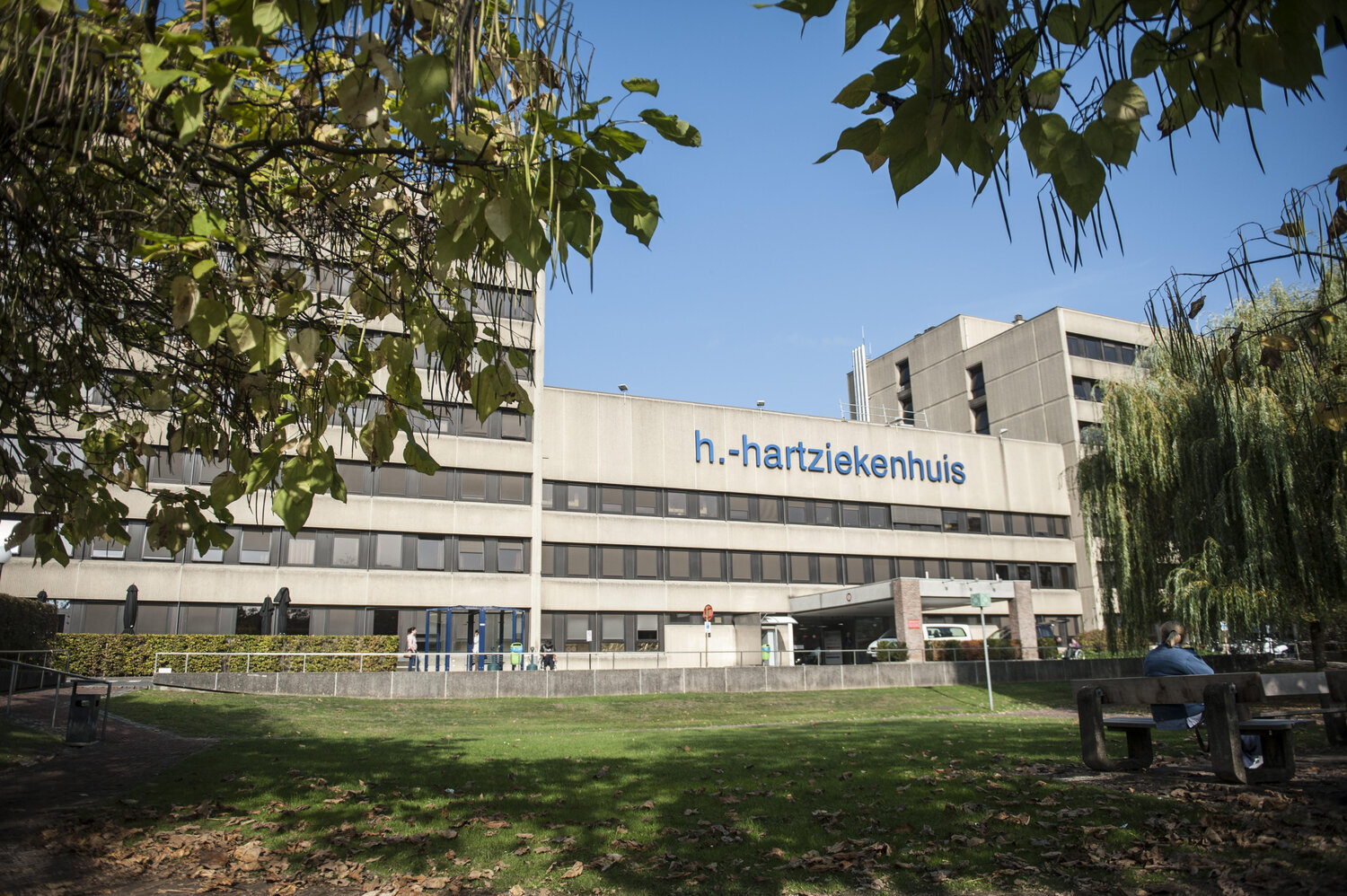
Heilig Hart Hospital Lier

Back to overview
Heilig Hart Hospital Lier

WAYFINDING STUDy

New signage for all outpatient clinics/consultations and functional departments

A BRIEF EXPLANATION

‘A heart for care’, under that motto the staff of the Heilig Hart Hospital Lier go to work every day to care for some 68,000 patients a year in emergency, day, or multi-day admission.  As a regional acute hospital with a full range of healthcare services for a wide region, Heilig Hart Hospital Lier strives for quality and innovation.

That’s why the Heilig Hart Hospital Lier is in the midst of renewal and preparing for the future. As a result, both patients and staff can enjoy a high-quality and progressive hospital where safety and cooperation are highly valued.

THE CHALLENGE

The signage in the hospital was very outdated and not up to date. Several new and planned extension and renovation works required urgent action. Moreover, the hospital had recently implemented a new corporate identity, which meant that the existing signage was totally out of sync with the new identity. Worst of all, however, was that many patients and visitors got lost, which led to frustration both among them and the staff. 

Signburo’s project was therefore twofold: to ensure that everyone – visitors, patients, and employees alike – gets to their destination as independently as possible, and to create signage in line with the new, revamped house style.
OUR SOLUTION

In our design of the new signage, all outpatient clinics/consultations and functional departments have been given their own route number. 

The reference is designed so that at each decision point, the direction is given to each route number that is in the hospital. Visitors can reach their correct destination by following the correct route number. 

That’s why it’s important that the right number is easily available to the visitor. Incidentally, signage does not consist solely of coding on route numbers. The nursing wards will retain their existing room numbers. 

However, since these room numbers are not always convenient to use, visitors are now directed to the correct lift first.  For this purpose, the lifts are renumbered alphabetically and recognisably repainted: the patient lifts were given a different colour than the visitor lifts, to make the distinction between the two clearer.

Everyone had to get used to this new signage concept, but after a while, it soon became clear that circulation within the hospital was much smoother and easier. Moreover, the new signage looks much fresher and more modern, which also makes it more pleasant to use.

Do you have a similar project? 

Schedule a meeting with us, at no obligation.